


Tablet Mockup — Free CSS iPad Device Frame Snippet
Tablet Mockup · Layouts · Plain HTML, CSS & JS · Live preview
Copy & paste
Source Code
<div class="tm-stage">
  <div class="tm-tablet portrait" id="tmTablet">
    <span class="tm-cam"></span>
    <div class="tm-screen">
      <div class="tm-app">
        <aside class="tm-side">
          <div class="tm-logo"></div>
          <span class="tm-dot on"></span><span class="tm-dot"></span><span class="tm-dot"></span><span class="tm-dot"></span>
        </aside>
        <main class="tm-main">
          <header class="tm-head"><h2>Dashboard</h2><div class="tm-pill"></div></header>
          <div class="tm-cards">
            <div class="tm-card"><small>Revenue</small><b>$48.2k</b><i class="tm-spark"></i></div>
            <div class="tm-card"><small>Users</small><b>9,310</b><i class="tm-spark s2"></i></div>
            <div class="tm-card"><small>Churn</small><b>1.4%</b><i class="tm-spark s3"></i></div>
          </div>
          <div class="tm-chart"><span></span><span></span><span></span><span></span><span></span><span></span><span></span></div>
        </main>
      </div>
    </div>
  </div>
  <button type="button" class="tm-rotate" id="tmRotate">Rotate</button>
</div>*{box-sizing:border-box;margin:0;padding:0}
body{font-family:system-ui,-apple-system,sans-serif;background:#e2e8f0;display:flex;justify-content:center;align-items:center;min-height:100vh;padding:24px}
.tm-stage{text-align:center}
.tm-tablet{position:relative;background:#0b1220;border-radius:30px;padding:16px;box-shadow:0 30px 60px -22px rgba(15,23,42,.5),inset 0 0 0 2px #1e293b;transition:width .5s cubic-bezier(.65,0,.35,1),height .5s cubic-bezier(.65,0,.35,1)}
.tm-tablet.portrait{width:300px;height:400px}
.tm-tablet.landscape{width:400px;height:300px}
.tm-cam{position:absolute;top:50%;left:8px;width:6px;height:6px;border-radius:50%;background:#1e293b;transform:translateY(-50%)}
.tm-tablet.landscape .tm-cam{top:8px;left:50%;transform:translateX(-50%)}
.tm-screen{width:100%;height:100%;border-radius:16px;overflow:hidden;background:#f8fafc}
.tm-app{display:flex;height:100%}
.tm-side{width:52px;background:#0f172a;display:flex;flex-direction:column;align-items:center;gap:14px;padding:16px 0}
.tm-logo{width:26px;height:26px;border-radius:8px;background:linear-gradient(135deg,#6366f1,#22d3ee);margin-bottom:6px}
.tm-dot{width:9px;height:9px;border-radius:50%;background:#334155}
.tm-dot.on{background:#6366f1}
.tm-main{flex:1;padding:16px;text-align:left;overflow:hidden}
.tm-head{display:flex;align-items:center;justify-content:space-between;margin-bottom:14px}
.tm-head h2{font-size:17px;font-weight:800;color:#0f172a}
.tm-pill{width:64px;height:24px;border-radius:99px;background:#6366f1}
.tm-cards{display:grid;grid-template-columns:repeat(3,1fr);gap:10px;margin-bottom:14px}
.tm-card{background:#fff;border:1px solid #e2e8f0;border-radius:12px;padding:10px}
.tm-card small{font-size:10px;color:#94a3b8;font-weight:700}
.tm-card b{display:block;font-size:17px;font-weight:800;color:#0f172a;margin:2px 0 8px}
.tm-spark{display:block;height:18px;border-radius:4px;background:linear-gradient(90deg,#c7d2fe,#6366f1)}
.tm-spark.s2{background:linear-gradient(90deg,#bbf7d0,#22c55e)}
.tm-spark.s3{background:linear-gradient(90deg,#fde68a,#f59e0b)}
.tm-chart{display:flex;align-items:flex-end;gap:8px;height:90px;background:#fff;border:1px solid #e2e8f0;border-radius:12px;padding:12px}
.tm-chart span{flex:1;border-radius:4px 4px 0 0;background:#6366f1;opacity:.85}
.tm-chart span:nth-child(1){height:40%}.tm-chart span:nth-child(2){height:65%}.tm-chart span:nth-child(3){height:50%}.tm-chart span:nth-child(4){height:80%}.tm-chart span:nth-child(5){height:60%}.tm-chart span:nth-child(6){height:95%}.tm-chart span:nth-child(7){height:72%}
.tm-rotate{margin-top:22px;background:#0f172a;color:#fff;border:none;border-radius:9px;padding:9px 18px;font-size:12.5px;font-weight:700;cursor:pointer;font-family:inherit}
.tm-rotate:hover{background:#1e293b}var tablet = document.getElementById('tmTablet');
document.getElementById('tmRotate').addEventListener('click', function () {
var toLandscape = tablet.classList.contains('portrait');
tablet.classList.toggle('portrait', !toLandscape);
tablet.classList.toggle('landscape', toLandscape);
});Extend with AI
Take This Snippet Further With AI
The AI prompt for this one is for Patreon supporters ($3 a month, 7 days free), along with a site with no ads. Supporters enter the passcode once and it is remembered in this browser.
What's included
Features
About this UI Snippet
Tablet Mockup — Pure-CSS iPad Frame with Rotate
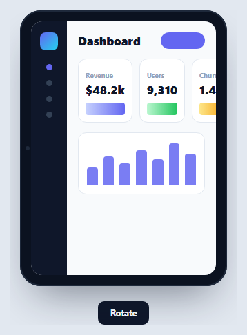
A tablet mockup frames a screen design inside an iPad-style device for landing pages, portfolios, and responsive demos. This one is pure HTML and CSS — no device photo — so it stays sharp at any size and holds live, interactive content. Its standout feature is a smooth portrait-to-landscape rotate that animates the frame's dimensions, in vanilla JavaScript with no dependency.
A frame built from nested rounded boxes
The device is a dark rounded rectangle with even padding (tablets have uniform thin bezels, unlike phones), wrapping an inner screen with a smaller border-radius. The constant gap between the two radii forms the bezel, an inset box-shadow adds an edge, and a soft drop shadow lifts it off the page. A small camera dot sits centered on one bezel and repositions when the device rotates.
Animated orientation change
Rotating swaps a .portrait / .landscape class that changes the frame's width and height (300×400 ↔ 400×300), and because both are transitioned with a cubic-bezier ease, the device visibly reflows between orientations rather than snapping. The camera dot's position is also class-driven, so it moves from the side bezel to the top bezel as part of the same transition — a detail that makes the rotate feel physical.
A responsive screen inside
The screen holds a real dashboard layout — an icon sidebar plus a main area with stat cards and a CSS bar chart — built with flexbox and grid. Because it's live DOM, the content genuinely reflows inside the frame as the aspect ratio changes, which is exactly what you want when demonstrating a responsive design across orientations.
CSS-only chart and sparklines
The stat cards use gradient-filled sparkline bars and the chart is seven <span>s with :nth-child heights — no SVG or canvas — so the whole screen is lightweight and recolors with a couple of variables. It's representative filler you can swap for your own components.
Reusing it as a wrapper
Keep the device markup as a component and replace the .tm-main contents with your screen. Pair it with a phone mockup to present a responsive design on two devices at once, or drop a single screenshot in for a clean portfolio shot.
Step by step
How to Use
- 1Paste HTML, CSS, and JSA CSS tablet renders in portrait with a dashboard screen inside.
- 2Press RotateThe frame animates between portrait and landscape dimensions.
- 3Watch the camera dotIt moves from the side bezel to the top as it rotates.
- 4See the content reflowThe dashboard layout adapts to the new aspect ratio.
- 5Drop in your screenReplace the main area with your own tablet UI.
- 6Reuse as a wrapperKeep the frame as a component with a screen slot.
Real-world uses
Common Use Cases
Got questions?
Frequently Asked Questions
Rotating toggles a portrait or landscape class that changes the frame's width and height (300×400 versus 400×300). Both dimensions have a CSS transition with a cubic-bezier ease, so the device visibly reflows between orientations instead of snapping. The camera dot's position is class-driven too, so it slides to the new bezel during the same transition.
Pure CSS. It's a dark rounded box with uniform padding wrapping a nested rounded screen; the gap between their radii is the bezel. There's no device photo, so it scales without blurring and you can recolor the frame or resize it just by changing CSS values.
Yes. The screen is live DOM built with flexbox and grid, so when the aspect ratio changes the dashboard genuinely re-lays out within the frame. That makes it useful for demonstrating a responsive design across orientations, not just showing a static picture.
Replace the contents of the .tm-main element (or the whole .tm-app) with your markup. The frame, bezels, and rotate logic are independent of the screen content, so your UI only needs to fit the screen box. Keep the device part as a reusable wrapper to swap screens easily.
Make the frame a component with an orientation prop or state that toggles the portrait/landscape class, and expose a screen slot for children. The rotate is a one-line class flip. In Tailwind, set the two orientations with conditional width/height utilities and add transition-[width,height] so they animate.