



Mobile Status Bar — Free iOS Status Bar UI Snippet
Mobile Status Bar · Mobile · Plain HTML, CSS & JS · Live preview
Copy & paste
Source Code
<div class="sb-wrap">
  <div class="sb-demo" id="sbDemo">
    <div class="sb-bar">
      <div class="sb-left">
        <span class="sb-time" id="sbTime">9:41</span>
      </div>
      <div class="sb-notch"></div>
      <div class="sb-right">
        <svg class="sb-signal" viewBox="0 0 20 12" width="18"><rect x="0" y="8" width="3" height="4" rx="1"/><rect x="5" y="6" width="3" height="6" rx="1"/><rect x="10" y="3" width="3" height="9" rx="1"/><rect x="15" y="0" width="3" height="12" rx="1"/></svg>
        <svg class="sb-wifi" viewBox="0 0 18 14" width="17"><path d="M9 13.2 1.4 5.6a11 11 0 0 1 15.2 0z" fill="none" stroke="currentColor" stroke-width="1.6"/><circle cx="9" cy="10.6" r="1.5"/></svg>
        <span class="sb-pct" id="sbPct">84%</span>
        <span class="sb-batt"><i id="sbFill"></i></span>
      </div>
    </div>
    <div class="sb-page">
      <h3>Screen content</h3>
      <p>The status bar sits flush at the top of any screen. Toggle the theme to see it adapt.</p>
    </div>
  </div>
  <div class="sb-controls">
    <button type="button" id="sbTheme">Toggle dark</button>
    <button type="button" id="sbNotch">Toggle notch</button>
  </div>
</div>*{box-sizing:border-box;margin:0;padding:0}
html{scrollbar-width:none;-ms-overflow-style:none}
html::-webkit-scrollbar{display:none}
body{font-family:system-ui,-apple-system,sans-serif;background:#475569;display:flex;justify-content:center;align-items:center;min-height:100vh;padding:24px;scrollbar-width:none;-ms-overflow-style:none}
body::-webkit-scrollbar{display:none}
.sb-wrap{text-align:center;width:100%;max-width:300px}
.sb-demo{border-radius:30px;overflow:hidden;background:#fff;color:#0f172a;box-shadow:0 24px 50px -20px rgba(0,0,0,.5);transition:background .3s,color .3s}
.sb-bar{display:flex;align-items:center;justify-content:space-between;padding:11px 26px 9px;font-weight:700;position:relative}
.sb-left,.sb-right{display:flex;align-items:center;gap:6px;flex:1}
.sb-right{justify-content:flex-end;fill:currentColor}
.sb-time{font-size:15px;font-variant-numeric:tabular-nums}
.sb-pct{font-size:12px;font-weight:700;font-variant-numeric:tabular-nums}
.sb-batt{width:24px;height:12px;border:1.5px solid currentColor;border-radius:3px;position:relative;display:inline-block;opacity:.9}
.sb-batt::after{content:'';position:absolute;right:-3px;top:3px;width:2px;height:6px;background:currentColor;border-radius:0 1px 1px 0}
.sb-batt i{position:absolute;left:1.5px;top:1.5px;bottom:1.5px;width:84%;background:currentColor;border-radius:1px;transition:width .3s}
.sb-notch{position:absolute;top:0;left:50%;transform:translateX(-50%);width:120px;height:26px;background:#000;border-radius:0 0 18px 18px;transition:opacity .25s,transform .25s}
.sb-demo.no-notch .sb-notch{opacity:0;transform:translateX(-50%) translateY(-26px)}
.sb-page{padding:24px;text-align:left;min-height:130px;background:linear-gradient(160deg,#eef2ff,#fff 60%)}
.sb-page h3{font-size:16px;font-weight:800}
.sb-page p{font-size:13px;color:#64748b;margin-top:6px;line-height:1.5}
.sb-demo.dark{background:#0f172a;color:#e2e8f0}
.sb-demo.dark .sb-page{background:linear-gradient(160deg,#1e293b,#0f172a 60%)}
.sb-demo.dark .sb-page h3{color:#f1f5f9}
.sb-controls{display:flex;gap:8px;margin-top:20px}
.sb-controls button{flex:1;background:#0f172a;color:#fff;border:none;border-radius:9px;padding:9px;font-size:12px;font-weight:700;cursor:pointer;font-family:inherit}
.sb-controls button:hover{background:#1e293b}var demo = document.getElementById('sbDemo');
var timeEl = document.getElementById('sbTime');
var fill = document.getElementById('sbFill');
var pct = document.getElementById('sbPct');
function tick() {
var d = new Date();
var h = d.getHours() % 12 || 12;
timeEl.textContent = h + ':' + ('0' + d.getMinutes()).slice(-2);
}
tick();
setInterval(tick, 10000);
// Read the real battery level when the API is available.
if (navigator.getBattery) {
navigator.getBattery().then(function (b) {
function show() { var p = Math.round(b.level * 100); pct.textContent = p + '%'; fill.style.width = Math.max(6, p) + '%'; }
show(); b.addEventListener('levelchange', show);
});
}
document.getElementById('sbTheme').addEventListener('click', function () { demo.classList.toggle('dark'); });
document.getElementById('sbNotch').addEventListener('click', function () { demo.classList.toggle('no-notch'); });Extend with AI
Take This Snippet Further With AI
The AI prompt for this one is for Patreon supporters ($3 a month), along with a site with no ads. Supporters enter the passcode once and it is remembered in this browser.
What's included
Features
About this UI Snippet
Mobile Status Bar — Reusable iOS-Style Top Bar
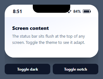
A mobile status bar is the thin strip at the top of every phone screen — time on the left; signal, wifi, and battery on the right — that app mockups and design systems need to look authentic. This snippet is a reusable, themeable status bar drawn entirely in HTML and CSS, with a live clock, real battery reading, an optional notch, and light/dark modes, in vanilla JavaScript with no dependency.
Icons drawn in CSS and SVG, not a font
The signal is four <rect>s of rising height in a tiny inline SVG; the wifi is a stroked arc with a dot; the battery is a bordered box with a nub ::after and an inner fill bar. Every glyph uses currentColor, so the whole bar inverts automatically when the theme flips — no separate dark-mode icon set. Building them inline keeps the component self-contained with no icon dependency.
A live clock and real battery
A tick() interval keeps the time current in 12-hour format. Where the browser supports it, navigator.getBattery() reads the actual device charge and updates the percentage and fill on levelchange, so the mockup reflects reality; it degrades gracefully to the default value where the API is unavailable.
The notch as a toggle
The notch is a single black pill anchored to the top center with bottom-rounded corners. A .no-notch class slides it up and fades it out via transitions, letting you switch between notched and flat-top devices — useful when one design system targets multiple phones. Because it's absolutely positioned, it overlays the bar without affecting layout.
Theming with one class
Light and dark are a single .dark class on the container; since text and icons are currentColor and backgrounds use the theme, flipping the class restyles the entire bar and the demo page beneath it. This mirrors how you'd drive a real app's status-bar style from the active theme.
Reusing it as a header
The status bar is built to sit flush atop any screen. Drop it above your content (or inside a phone mockup) and it provides the device chrome for free. Keep it as a component and pass a theme prop, and every screen in your design — login, onboarding, dashboard — gets a consistent, live top bar.
Step by step
How to Use
- 1Paste HTML, CSS, and JSA status bar renders flush above a demo screen.
- 2Watch the clockThe time updates live in 12-hour format.
- 3See the batteryWhere supported, it reads the real device charge.
- 4Toggle dark modeOne class flips the bar and page to a dark theme.
- 5Toggle the notchSwitch between notched and flat-top devices.
- 6Reuse itPlace it atop any screen as device chrome.
Real-world uses
Common Use Cases
currentColor makes every icon invert automatically with light and dark themes.Got questions?
Frequently Asked Questions
No — they're inline SVG and CSS. The signal is four rising rects, the wifi is a stroked arc with a dot, and the battery is a bordered box with a nub pseudo-element and a fill bar. All use currentColor, so they recolor with the text and invert in dark mode without a separate icon set.
Where the browser supports navigator.getBattery(), yes — it reads the actual charge, sets the percentage and fill width, and listens for levelchange to stay current. In contexts without the API it simply keeps the default value, so it never breaks; it just falls back to a static level.
The notch is one black pill positioned at the top center with bottom-rounded corners and a high stacking order, so it overlays the bar without affecting layout. A no-notch class translates it up and fades it via CSS transitions, letting you switch between notched and flat-top device styles instantly.
A single dark class on the container. Because the icons and text use currentColor and the backgrounds reference the theme, toggling that one class restyles the entire bar and the demo page beneath it — the same way you'd switch a real app's status-bar appearance based on the active theme.
Make it a component with a theme prop that sets the dark class and a notch boolean. Put the clock interval and the getBattery subscription in a mount effect with cleanup. Render it at the top of each screen as shared chrome. In Tailwind, lay out the bar with flex justify-between and build the icons as small inline SVGs using currentColor.