


Sidebar Mini — Free HTML CSS JS Collapsible Icon Sidebar Nav
Sidebar Mini · Navigation · Plain HTML, CSS & JS · Live preview
Copy & paste
Source Code
<div class="sm-app">
  <aside class="sm-side" id="smSide">
    <div class="sm-top">
      <div class="sm-logo"><span class="sm-mark">◆</span><span class="sm-word">Polaris</span></div>
      <button type="button" class="sm-toggle" id="smToggle" aria-label="Collapse sidebar" aria-expanded="true">
        <svg viewBox="0 0 24 24"><path d="M15 6l-6 6 6 6"/></svg>
      </button>
    </div>
    <nav class="sm-nav">
      <a class="sm-item is-active" href="#" data-tip="Dashboard"><svg viewBox="0 0 24 24"><path d="M3 13h8V3H3zM13 21h8V3h-8zM3 21h8v-6H3z"/></svg><span>Dashboard</span></a>
      <a class="sm-item" href="#" data-tip="Analytics"><svg viewBox="0 0 24 24"><path d="M3 3v18h18M7 14l3-3 4 4 5-6"/></svg><span>Analytics</span></a>
      <a class="sm-item" href="#" data-tip="Projects"><svg viewBox="0 0 24 24"><path d="M3 7h18v13H3zM3 7l2-3h6l2 3"/></svg><span>Projects</span></a>
      <a class="sm-item" href="#" data-tip="Messages"><svg viewBox="0 0 24 24"><path d="M21 15a2 2 0 0 1-2 2H7l-4 4V5a2 2 0 0 1 2-2h14a2 2 0 0 1 2 2z"/></svg><span>Messages</span></a>
      <a class="sm-item" href="#" data-tip="Settings"><svg viewBox="0 0 24 24"><circle cx="12" cy="12" r="3"/><path d="M19 12a7 7 0 0 0-.1-1l2-1.5-2-3.5-2.4 1a7 7 0 0 0-1.7-1L14.5 2h-5l-.3 2.5a7 7 0 0 0-1.7 1l-2.4-1-2 3.5 2 1.5a7 7 0 0 0 0 2l-2 1.5 2 3.5 2.4-1a7 7 0 0 0 1.7 1l.3 2.5h5l.3-2.5a7 7 0 0 0 1.7-1l2.4 1 2-3.5-2-1.5a7 7 0 0 0 .1-1z"/></svg><span>Settings</span></a>
    </nav>
    <a class="sm-item sm-user" href="#" data-tip="Sign out"><span class="sm-av">AM</span><span>Aria Moss</span></a>
  </aside>
  <main class="sm-main"><p>Click the chevron to collapse the sidebar to icons. Hover a collapsed item for its label.</p></main>
</div>*{box-sizing:border-box;margin:0;padding:0}
body{font-family:system-ui,-apple-system,sans-serif;background:#0a0c14}
.sm-app{display:flex;min-height:100vh}
.sm-side{--w:236px;width:var(--w);flex-shrink:0;background:#11141f;border-right:1px solid #1f2433;display:flex;flex-direction:column;padding:14px 12px;gap:6px;transition:width .28s cubic-bezier(.4,0,.2,1)}
.sm-side.is-collapsed{--w:74px}
.sm-top{display:flex;align-items:center;justify-content:space-between;padding:6px 8px 14px;margin-bottom:4px;border-bottom:1px solid #1c2130}
.sm-logo{display:flex;align-items:center;gap:11px;overflow:hidden}
.sm-mark{color:#7c5cff;font-size:20px;flex-shrink:0}
.sm-word{color:#fff;font-weight:800;font-size:17px;white-space:nowrap}
.sm-toggle{background:none;border:0;cursor:pointer;color:#8089a3;padding:4px;border-radius:7px;flex-shrink:0;display:flex}
.sm-toggle svg{width:20px;height:20px;fill:none;stroke:#8089a3;stroke-width:2.2;stroke-linecap:round;stroke-linejoin:round;transition:transform .28s}
.sm-side.is-collapsed .sm-toggle svg{transform:rotate(180deg)}
.sm-nav{display:flex;flex-direction:column;gap:4px;flex:1}
.sm-item{position:relative;display:flex;align-items:center;gap:13px;padding:10px 11px;border-radius:10px;color:#9aa1b8;text-decoration:none;white-space:nowrap;overflow:hidden;transition:background .15s,color .15s}
.sm-item svg{width:21px;height:21px;flex-shrink:0;fill:none;stroke:currentColor;stroke-width:2;stroke-linecap:round;stroke-linejoin:round}
.sm-item span:not(.sm-av){opacity:1;transition:opacity .2s}
.sm-side.is-collapsed .sm-item span:not(.sm-av){opacity:0}
.sm-item:hover{background:#1a1f2e;color:#e7eaf3}
.sm-item.is-active{background:rgba(124,92,255,.14);color:#c4b5fd}
.sm-user{margin-top:6px;border-top:1px solid #1c2130;padding-top:14px}
.sm-av{width:30px;height:30px;flex-shrink:0;border-radius:50%;background:linear-gradient(135deg,#7c5cff,#ec4899);color:#fff;font-size:11px;font-weight:700;display:flex;align-items:center;justify-content:center}
/* Tooltip shown only when collapsed. */
.sm-side.is-collapsed .sm-item::after{content:attr(data-tip);position:absolute;left:calc(100% + 10px);top:50%;transform:translateY(-50%);background:#252b3d;color:#fff;font-size:12px;padding:6px 10px;border-radius:7px;white-space:nowrap;opacity:0;pointer-events:none;transition:opacity .14s;z-index:10;box-shadow:0 8px 20px rgba(0,0,0,.4)}
.sm-side.is-collapsed .sm-item:hover::after{opacity:1}
.sm-main{flex:1;padding:40px}
.sm-main p{color:#8a92a8;font-size:15px;max-width:420px;line-height:1.6}var side = document.getElementById('smSide');
var toggle = document.getElementById('smToggle');
toggle.addEventListener('click', function () {
var collapsed = side.classList.toggle('is-collapsed');
toggle.setAttribute('aria-expanded', collapsed ? 'false' : 'true');
toggle.setAttribute('aria-label', collapsed ? 'Expand sidebar' : 'Collapse sidebar');
});
// Highlight the clicked nav item.
side.querySelectorAll('.sm-nav .sm-item').forEach(function (item) {
item.addEventListener('click', function (e) {
e.preventDefault();
side.querySelectorAll('.sm-nav .sm-item').forEach(function (i) { i.classList.remove('is-active'); });
item.classList.add('is-active');
});
});Extend with AI
Take This Snippet Further With AI
The AI prompt for this one is for Patreon supporters ($3 a month), along with a site with no ads. Supporters enter the passcode once and it is remembered in this browser.
What's included
Features
About this UI Snippet
Sidebar Mini — A Collapsible Icon-Rail Navigation
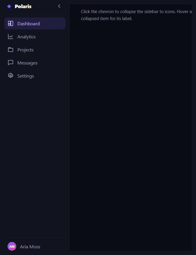
The sidebar mini is the collapsible app navigation that shrinks from a full labelled column to a slim icon-only rail and back — the space-saving sidebar used in dashboards, editors, and admin panels. This snippet builds it with plain HTML, CSS transitions, and a tiny vanilla JavaScript toggle, including hover tooltips that appear only when collapsed.
One width variable drives the collapse
The sidebar's width is a CSS custom property (--w) with a transition, and collapsing simply swaps that variable from 236px to 74px via an is-collapsed class. Because everything inside is laid out with flexbox, the icons stay put on the left while the labels are clipped by the narrowing container — there's no per-element width juggling. Animating the width gives the smooth expand/contract that makes the rail feel like a single moving panel.
Labels fade as the rail narrows
The text labels are faded out with opacity (and clipped by overflow: hidden) when collapsed, rather than removed, so they don't reflow or pop — they dissolve as the icons slide to the centre of the rail. The chevron toggle button also rotates 180° to mirror the open/closed direction, a small affordance that signals what the click will do.
Tooltips, but only when collapsed
When the labels are hidden, the navigation would be cryptic, so each item exposes its name through a data-tip attribute that a CSS ::after tooltip reads — but only under the .is-collapsed selector. So in the expanded state the labels are visible and there are no tooltips; collapsed, hovering an icon reveals its label in a floating chip beside the rail. This is the standard pattern for icon-rail navigation and keeps the collapsed state usable.
Active state and structure
Clicking a nav item moves an is-active highlight to it, and the layout reserves a pinned user row at the bottom with a gradient initials avatar. The whole thing is built from real anchor elements with inline SVG icons, so it's lightweight, themeable with currentColor, and easy to wire to a router.
Accessibility
The toggle updates aria-expanded and its aria-label ("Collapse"/"Expand") as the state changes, so assistive tech announces the control correctly. Icons pair with text labels (visible when expanded, tooltip when collapsed), so navigation is never conveyed by icon shape alone.
Customizing it
Change the two widths, the transition speed, the accent, or the icon set; persist the collapsed state to localStorage; or collapse automatically below a breakpoint. Pair it with a sidebar nav, a dashboard layout, or a floating dock.
Step by step
How to Use
- 1Paste HTML, CSS, and JSA full labelled sidebar renders beside content.
- 2Click the chevronThe sidebar collapses to an icon rail.
- 3Hover a collapsed iconA tooltip shows that item's label.
- 4Click a nav itemThe active highlight moves to it.
- 5Expand againThe chevron flips and labels fade back in.
- 6Tune the widthsChange the expanded and collapsed --w values.
Real-world uses
Common Use Cases
--w property for the width.data-tip tooltips appearing only when the rail is narrow.Got questions?
Frequently Asked Questions
The sidebar width is a CSS custom property --w with a transition, and the is-collapsed class swaps it from 236px to 74px. Because the interior is laid out with flexbox, the icons stay on the left while labels are clipped by the narrowing container, so the whole rail animates as one panel with no per-element width changes.
Each item carries its name in a data-tip attribute, and a CSS ::after tooltip reads it — but the rule is scoped under the .is-collapsed selector. Expanded, the labels are visible and there are no tooltips; collapsed, hovering an icon reveals its label in a floating chip. This keeps the icon-only state usable without redundant tooltips when text is already shown.
The labels are faded with opacity and clipped by overflow: hidden rather than removed from the DOM, so they dissolve as the rail narrows instead of reflowing or popping out. This makes the collapse read as a smooth visual change rather than a layout jump.
The toggle button updates aria-expanded and its aria-label between Collapse and Expand as the state changes, so screen readers announce the control correctly. Every nav item pairs an icon with a text label — visible when expanded, shown as a tooltip when collapsed — so navigation is never conveyed by icon shape alone.
Hold a collapsed boolean in state and bind the is-collapsed class to it, persisting to localStorage if you want it to stick. Render nav items from an array with their icon, label, and tip. Keep the active route in state or derive it from the router. All the width, fade, and tooltip behaviour is CSS, so it ports unchanged.
Yes. While the Sidebar Mini snippet gives you one pattern to copy, the free Responsive Navbar Builder at webdevpuneet.com/navbar-builder/ designs a whole navigation bar: logo, links and dropdown menus, a mobile hamburger menu (dropdown panel, slide-in drawer or full screen) and a scroll effect (sticky, shrink, hide on scroll or transparent). It has six presets, a live preview that runs the real code, and exports HTML + CSS + vanilla JS, React, Tailwind, Vue 3 or Angular — or you can click Fork & Edit to keep editing it in My Code.