


Toast Queue — Free HTML CSS JS Snippet
Toast Queue · Modals · Plain HTML, CSS & JS · Live preview
Copy & paste
Source Code
<div class="demo">
  <div class="trigger-grid">
    <button class="trig success" onclick="toast('success','Changes saved','Your profile has been updated.')">Success</button>
    <button class="trig error" onclick="toast('error','Upload failed','File too large. Max size is 10 MB.')">Error</button>
    <button class="trig info" onclick="toast('info','New version available','v2.4.0 includes performance fixes.')">Info</button>
    <button class="trig warning" onclick="toast('warning','Session expiring','You will be logged out in 5 minutes.')">Warning</button>
    <button class="trig neutral" onclick="toast('neutral','Synced','All changes backed up to Gist.')">Neutral</button>
    <button class="trig dismiss" onclick="dismissAll()">Dismiss all</button>
  </div>
</div>

<div class="toast-container" id="toast-container" aria-live="polite" aria-label="Notifications"></div>
* { box-sizing: border-box; margin: 0; padding: 0; }
body { font-family: system-ui, sans-serif; background: #f1f5f9; min-height: 100vh; display: flex; align-items: center; justify-content: center; padding: 24px; }
.demo { display: flex; flex-direction: column; align-items: center; gap: 16px; }
.trigger-grid { display: grid; grid-template-columns: repeat(3, 1fr); gap: 8px; }
.trig { padding: 10px 14px; border-radius: 9px; border: none; font-size: 13px; font-weight: 700; cursor: pointer; transition: opacity 0.12s; font-family: inherit; }
.trig:hover { opacity: 0.85; }
.trig.success { background: rgba(34,197,94,0.12); color: #16a34a; }
.trig.error { background: rgba(239,68,68,0.12); color: #dc2626; }
.trig.info { background: rgba(99,102,241,0.12); color: #4f46e5; }
.trig.warning { background: rgba(245,158,11,0.12); color: #b45309; }
.trig.neutral { background: rgba(100,116,139,0.12);color: #475569; }
.trig.dismiss { background: #1e293b; color: #fff; grid-column: 1/-1; }
/* Toast container */
.toast-container { position: fixed; bottom: 16px; left: 50%; transform: translateX(-50%); display: flex; flex-direction: column-reverse; gap: 8px; z-index: 9999; width: min(340px, calc(100vw - 32px)); pointer-events: none; }
/* Individual toast */
.toast { background: #fff; border-radius: 12px; padding: 13px 14px; display: flex; align-items: flex-start; gap: 10px; box-shadow: 0 4px 24px rgba(0,0,0,0.1); border-left: 3px solid; pointer-events: all; animation: toastIn 0.3s cubic-bezier(0.32,0.72,0,1) forwards; position: relative; overflow: hidden; }
.toast.leaving { animation: toastOut 0.25s ease forwards; }
@keyframes toastIn { from { opacity:0; transform:translateX(40px) scale(0.96); } to { opacity:1; transform:none; } }
@keyframes toastOut { to { opacity:0; transform:translateX(40px) scale(0.96); max-height:0; padding:0; margin:0; } }
/* Progress bar */
.toast-progress { position: absolute; bottom: 0; left: 0; height: 2px; animation: shrink linear forwards; }
@keyframes shrink { from { width: 100%; } to { width: 0%; } }
/* Colours per type */
.toast.success { border-color: #22c55e; }
.toast.success .toast-icon { color: #16a34a; }
.toast.success .toast-progress { background: #22c55e; }
.toast.error { border-color: #ef4444; }
.toast.error .toast-icon { color: #dc2626; }
.toast.error .toast-progress { background: #ef4444; }
.toast.info { border-color: #6366f1; }
.toast.info .toast-icon { color: #4f46e5; }
.toast.info .toast-progress { background: #6366f1; }
.toast.warning { border-color: #f59e0b; }
.toast.warning .toast-icon { color: #b45309; }
.toast.warning .toast-progress { background: #f59e0b; }
.toast.neutral { border-color: #94a3b8; }
.toast.neutral .toast-icon { color: #64748b; }
.toast.neutral .toast-progress { background: #94a3b8; }
.toast-icon { flex-shrink: 0; margin-top: 1px; }
.toast-body { flex: 1; min-width: 0; }
.toast-title { font-size: 13px; font-weight: 700; color: #0f172a; }
.toast-msg { font-size: 12px; color: #64748b; margin-top: 2px; line-height: 1.5; }
.toast-close { background: none; border: none; color: #94a3b8; font-size: 16px; cursor: pointer; padding: 0 2px; flex-shrink: 0; transition: color 0.12s; line-height: 1; margin-top: -1px; }
.toast-close:hover { color: #374151; }const ICONS = {
success: '<svg width="16" height="16" viewBox="0 0 24 24" fill="none" stroke="currentColor" stroke-width="2.5" stroke-linecap="round"><circle cx="12" cy="12" r="10"/><polyline points="9 12 11 14 15 10"/></svg>',
error: '<svg width="16" height="16" viewBox="0 0 24 24" fill="none" stroke="currentColor" stroke-width="2.5" stroke-linecap="round"><circle cx="12" cy="12" r="10"/><line x1="15" y1="9" x2="9" y2="15"/><line x1="9" y1="9" x2="15" y2="15"/></svg>',
info: '<svg width="16" height="16" viewBox="0 0 24 24" fill="none" stroke="currentColor" stroke-width="2.5" stroke-linecap="round"><circle cx="12" cy="12" r="10"/><line x1="12" y1="8" x2="12" y2="12"/><line x1="12" y1="16" x2="12.01" y2="16"/></svg>',
warning: '<svg width="16" height="16" viewBox="0 0 24 24" fill="none" stroke="currentColor" stroke-width="2.5" stroke-linecap="round"><path d="M10.29 3.86L1.82 18a2 2 0 0 0 1.71 3h16.94a2 2 0 0 0 1.71-3L13.71 3.86a2 2 0 0 0-3.42 0z"/><line x1="12" y1="9" x2="12" y2="13"/><line x1="12" y1="17" x2="12.01" y2="17"/></svg>',
neutral: '<svg width="16" height="16" viewBox="0 0 24 24" fill="none" stroke="currentColor" stroke-width="2.5" stroke-linecap="round"><path d="M4.5 9A8 8 0 0 1 19 8"/><path d="M19.5 15A8 8 0 0 1 5 16"/><path d="M19 5v4h-4"/><path d="M5 19v-4h4"/></svg>',
};
const DURATION = 4000;
const MAX = 5;
function toast(type, title, msg) {
const container = document.getElementById('toast-container');
// Remove oldest if over max
const toasts = container.querySelectorAll('.toast:not(.leaving)');
if (toasts.length >= MAX) dismiss(toasts[toasts.length - 1]);
const el = document.createElement('div');
el.className = 'toast ' + type;
el.innerHTML =
'<div class="toast-icon">' + ICONS[type] + '</div>' +
'<div class="toast-body"><div class="toast-title">' + title + '</div>' +
(msg ? '<div class="toast-msg">' + msg + '</div>' : '') + '</div>' +
'<button class="toast-close" onclick="dismiss(this.closest('.toast'))" aria-label="Dismiss">×</button>' +
'<div class="toast-progress" style="animation-duration:' + DURATION + 'ms"></div>';
container.prepend(el);
const timer = setTimeout(() => dismiss(el), DURATION);
el.dataset.timer = timer;
// Pause on hover
el.addEventListener('mouseenter', () => {
clearTimeout(+el.dataset.timer);
el.querySelector('.toast-progress').style.animationPlayState = 'paused';
});
el.addEventListener('mouseleave', () => {
el.querySelector('.toast-progress').style.animationPlayState = 'running';
el.dataset.timer = setTimeout(() => dismiss(el), 1500);
});
}
function dismiss(el) {
if (!el || el.classList.contains('leaving')) return;
clearTimeout(+el.dataset.timer);
el.classList.add('leaving');
el.addEventListener('animationend', () => el.remove(), { once: true });
}
function dismissAll() {
document.querySelectorAll('.toast').forEach(dismiss);
}Extend with AI
Take This Snippet Further With AI
The AI prompt for this one is for Patreon supporters ($3 a month, 7 days free), along with a site with no ads. Supporters enter the passcode once and it is remembered in this browser.
What's included
Features
About this UI Snippet
Toast Queue — Multi-Toast Stack, Progress Bar, Hover Pause, Auto-Dismiss & Max Limit
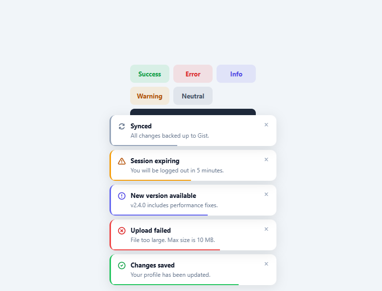
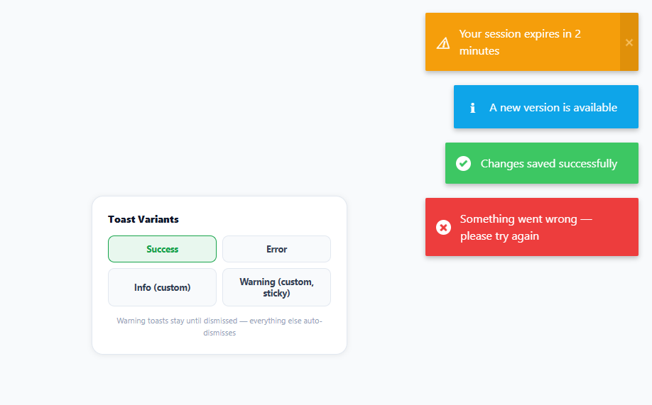
A toast notification queue manages multiple simultaneous toasts — stacking them, auto-dismissing each after a timeout, pausing on hover, and removing the oldest when a maximum count is reached. This is the production-grade version of a single toast notification. It handles the real-world case where multiple operations complete or fail simultaneously. This snippet provides: five semantic toast types (success, error, info, warning, neutral), a CSS progress bar that drains over the dismiss duration, hover-to-pause, animated entrance and exit, a dismiss-all button, and a configurable maximum stack size.
The toast queue architecture
Toasts are prepended to a column-reverse flex container — prepend adds at the visual bottom of the stack (newest appears below older toasts). The flex-direction: column-reverse means the newest toast is at the DOM top but visually at the bottom-right, appearing to "stack up" from the corner. Each toast gets an individual setTimeout for auto-dismiss stored in a data-timer attribute.
The CSS progress bar
Each toast contains a .toast-progress div with animation: shrink linear forwards. The animation runs for DURATION milliseconds (4000ms by default), shrinking width from 100% to 0%. The animation-duration is set as an inline style from the JavaScript constant. When the user hovers, the animation is paused via animationPlayState and a new shorter timer (1500ms) starts on mouseleave.
Hover-to-pause
On mouseenter, clearTimeout removes the pending auto-dismiss. The progress bar animation is paused. On mouseleave, the animation resumes and a new 1500ms timer starts. This gives users time to read toasts without the timer running while they are focused on the notification.
The maximum stack limit
Before adding a new toast, the queue checks the count of non-leaving toasts. If equal to MAX (5), the oldest toast (last in the column-reverse list) is dismissed first. This prevents the toast stack from growing unboundedly on rapid triggers.
The exit animation
The .leaving class triggers an exit animation: toastOut slides the toast to the right with scale(0.96) and opacity 0, while also animating max-height and padding to 0. This collapse animation removes the toast from the visual stack without leaving a gap.
Integrating with a global event bus
For framework-free apps, dispatch and listen to custom events: window.dispatchEvent(new CustomEvent("toast", { detail: { type:"success", title:"Saved!" } })). Add a listener: window.addEventListener("toast", e => toast(e.detail.type, e.detail.title, e.detail.msg)). Any module or component can now fire toasts without direct function calls. This decoupled pattern prevents circular dependencies in larger applications.
Step by step
How to Use
- 1Click the trigger buttons to show different toast typesEach button shows a toast with a matching colour, icon, and progress bar. Hover a toast to pause its timer. Add 6 toasts to see the oldest one auto-dismiss when the stack limit is reached.
- 2Call toast() from anywhere in your codetoast("success", "Saved!", "Optional description") — first arg is the type, second is the title, third is an optional message. Call from API callbacks, form handlers, or any async operation.
- 3Change the auto-dismiss durationUpdate const DURATION = 4000 at the top of the JS. The progress bar animation-duration updates automatically since it reads from this constant. Use 3000 for quick feedback toasts, 6000 for important warnings.
- 4Change the maximum simultaneous toastsUpdate const MAX = 5 to control the stack limit. The oldest toast dismisses automatically when a new toast would exceed this limit.
- 5Change the toast positionUpdate .toast-container CSS: bottom/right for bottom-right (default), top/right for top-right, bottom/left for bottom-left. For centred top toasts, use top:24px; left:50%; transform:translateX(-50%); and change flex-direction to column.
- 6Export in your formatClick "HTML" for a standalone file, "JSX" for a React component with a toast context/hook, or "Tailwind" for a React + Tailwind CSS version.
Real-world uses
Common Use Cases
Got questions?
Frequently Asked Questions
On mouseenter: clearTimeout(+el.dataset.timer) cancels the pending dismiss. el.querySelector(".toast-progress").style.animationPlayState = "paused" freezes the visual progress bar. On mouseleave: the progress animation resumes with animationPlayState = "running". A new setTimeout of 1500ms starts — shorter than the original duration so toasts that were hovered still dismiss reasonably quickly after the user stops hovering. The data-timer attribute holds the current timer ID for each toast independently.
Create a ToastContext: const ToastContext = React.createContext(null). In a ToastProvider, manage toasts as useState([]) and expose a toast() function via the context. Components call const { toast } = useContext(ToastContext). Render the <ToastContainer> inside the provider. This gives any component in the tree access to add toasts without prop drilling. For TypeScript, define a ToastType and use useReducer for more complex state management.
Add a button inside the toast HTML: after the toast-msg div, add <button class="toast-action" onclick="handleAction()">View details</button>. Style .toast-action with font-size:12px; font-weight:700; color:inherit; background:transparent; border:1px solid currentColor; border-radius:6px; padding:3px 10px; cursor:pointer; margin-top:6px. The action button clicking should also dismiss the toast: onclick="handleAction(); dismiss(this.closest('.toast'))".
Add a message ID to each toast: el.dataset.toastId = title + "-" + type. Before adding, check for duplicates: if (container.querySelector("[data-toast-id='" + toastId + "']")) { bump animation on existing toast instead of creating new. }. This prevents "Changes saved" from appearing 5 times if the user clicks save rapidly. The bump animation (brief scale up and down) communicates that a duplicate was received without adding visual clutter.