



Wallet Card — Free 3D Flip Credit Card UI Snippet
Wallet Card · Mobile · Plain HTML, CSS & JS · Live preview
Copy & paste
Source Code
<div class="wc-stage">
<div class="wc-card" id="wcCard">
<div class="wc-inner">
<div class="wc-front">
<div class="wc-top"><span class="wc-brand">AURORA</span><span class="wc-net">credit</span></div>
<div class="wc-chip"></div>
<div class="wc-num">4921 7634 8810 2245</div>
<div class="wc-row">
<div><small>Card holder</small><b>ALEX MORGAN</b></div>
<div><small>Expires</small><b>08/29</b></div>
<div class="wc-logo"><i></i><i></i></div>
</div>
</div>
<div class="wc-back">
<div class="wc-stripe"></div>
<div class="wc-sig"><span>ALEX MORGAN</span><b>921</b></div>
<div class="wc-barcode"></div>
<p class="wc-note">Tap card to flip back</p>
</div>
</div>
</div>
<button type="button" class="wc-flip" id="wcFlip">Flip card</button>
</div>*{box-sizing:border-box;margin:0;padding:0}
body{font-family:system-ui,-apple-system,sans-serif;background:#0f172a;display:flex;justify-content:center;align-items:center;min-height:100vh;padding:24px}
.wc-stage{text-align:center}
.wc-card{width:320px;height:200px;perspective:1200px;cursor:pointer}
.wc-inner{position:relative;width:100%;height:100%;transition:transform .7s cubic-bezier(.4,.2,.2,1);transform-style:preserve-3d}
.wc-card.flipped .wc-inner{transform:rotateY(180deg)}
.wc-front,.wc-back{position:absolute;inset:0;border-radius:18px;backface-visibility:hidden;-webkit-backface-visibility:hidden;overflow:hidden;color:#fff;box-shadow:0 24px 44px -20px rgba(0,0,0,.7)}
.wc-front{background:linear-gradient(135deg,#4f46e5,#7c3aed 55%,#db2777);padding:20px}
.wc-front::after{content:'';position:absolute;top:-40%;right:-10%;width:200px;height:200px;border-radius:50%;background:rgba(255,255,255,.12)}
.wc-top{display:flex;justify-content:space-between;align-items:flex-start;position:relative;z-index:2}
.wc-brand{font-size:17px;font-weight:800;letter-spacing:2px}
.wc-net{font-size:11px;text-transform:uppercase;letter-spacing:1px;opacity:.8}
.wc-chip{width:42px;height:32px;border-radius:7px;background:linear-gradient(135deg,#fde68a,#f59e0b);margin:18px 0 16px;position:relative}
.wc-chip::before{content:'';position:absolute;inset:6px 8px;border:1px solid rgba(120,53,15,.4);border-radius:3px}
.wc-num{font-size:19px;letter-spacing:1px;font-weight:600;font-family:ui-monospace,Menlo,monospace;text-shadow:0 1px 2px rgba(0,0,0,.3)}
.wc-row{display:flex;align-items:flex-end;gap:24px;margin-top:16px;position:relative;z-index:2}
.wc-row small{font-size:8px;text-transform:uppercase;letter-spacing:1px;opacity:.7;display:block}
.wc-row b{font-size:13px;font-weight:700;letter-spacing:.5px}
.wc-logo{margin-left:auto;display:flex}
.wc-logo i{width:30px;height:30px;border-radius:50%}
.wc-logo i:nth-child(1){background:#eb001b}
.wc-logo i:nth-child(2){background:#f79e1b;mix-blend-mode:screen;margin-left:-14px}
.wc-back{background:linear-gradient(135deg,#312e81,#581c87);transform:rotateY(180deg);padding-top:22px}
.wc-stripe{height:38px;background:#0b1020}
.wc-sig{display:flex;align-items:center;gap:10px;margin:16px 16px 0}
.wc-sig span{flex:1;height:30px;background:repeating-linear-gradient(45deg,#e2e8f0,#e2e8f0 6px,#cbd5e1 6px,#cbd5e1 12px);border-radius:4px;color:#0f172a;font-size:11px;font-weight:700;display:flex;align-items:center;padding:0 10px;font-style:italic}
.wc-sig b{background:#fff;color:#0f172a;font-size:13px;font-weight:800;padding:4px 9px;border-radius:4px}
.wc-barcode{height:34px;margin:14px 16px 0;background:repeating-linear-gradient(90deg,#fff 0 2px,transparent 2px 3px,#fff 3px 4px,transparent 4px 7px)}
.wc-note{text-align:center;font-size:10px;opacity:.7;margin-top:12px}
.wc-flip{margin-top:24px;background:#1e293b;color:#fff;border:none;border-radius:9px;padding:9px 18px;font-size:12.5px;font-weight:700;cursor:pointer;font-family:inherit}
.wc-flip:hover{background:#334155}var card = document.getElementById('wcCard');
function flip() { card.classList.toggle('flipped'); }
card.addEventListener('click', flip);
document.getElementById('wcFlip').addEventListener('click', function (e) { e.stopPropagation(); flip(); });
// Subtle 3D tilt on pointer move when the card is showing its front.
card.addEventListener('pointermove', function (e) {
if (card.classList.contains('flipped')) return;
var r = card.getBoundingClientRect();
var rx = ((e.clientY - r.top) / r.height - 0.5) * -10;
var ry = ((e.clientX - r.left) / r.width - 0.5) * 12;
card.querySelector('.wc-inner').style.transform = 'rotateX(' + rx.toFixed(1) + 'deg) rotateY(' + ry.toFixed(1) + 'deg)';
});
card.addEventListener('pointerleave', function () {
if (!card.classList.contains('flipped')) card.querySelector('.wc-inner').style.transform = '';
});Extend with AI
Take This Snippet Further With AI
The AI prompt for this one is for Patreon supporters ($3 a month), along with a site with no ads. Supporters enter the passcode once and it is remembered in this browser.
What's included
Features
About this UI Snippet
Wallet Card — 3D Flip Credit / Membership Card
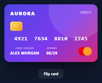
A wallet card is the visual credit, loyalty, or membership card you see in wallet apps and checkout flows — a glossy front with a chip and number, and a back with a signature strip and barcode. This snippet builds a 3D flippable one in HTML and CSS, with a real card flip and a subtle pointer tilt, in vanilla JavaScript with no dependency. It's a display card (not an input) ideal for wallets, profiles, and fintech UIs.
The 3D flip with preserve-3d
The flip is the core technique. A .wc-inner wrapper has transform-style: preserve-3d inside a perspective container, and the front and back faces are stacked absolutely with backface-visibility: hidden. The back is pre-rotated 180deg, so when a .flipped class rotates the inner wrapper rotateY(180deg), the front turns away (hidden) and the back turns to face you — a true 3D card flip transitioned over 0.7s, not a crossfade.
A realistic card front in pure CSS
The front is a gradient with a soft circular highlight (::after), an EMV chip drawn as a gold gradient box with an inset contact rectangle, a monospace card number with a subtle text-shadow, and the holder/expiry labels. The network logo is the classic two overlapping circles using mix-blend-mode: screen so the overlap brightens like the Mastercard mark — all CSS, no images.
The card back
The back has a black magnetic stripe, a signature panel drawn with a diagonal repeating-linear-gradient (the hatched signature look) plus a CVV box, and a barcode made from a vertical repeating-linear-gradient of thin bars. These patterns recreate the familiar back-of-card details without any assets.
Pointer tilt for depth
When the front is showing, a pointermove handler maps the cursor position to small rotateX/rotateY values, so the card tilts toward the pointer for a premium, tactile feel; it resets on leave and is suppressed while flipped so it doesn't fight the flip transform. Clicking the card (or the button) toggles the flip.
Reusing it
Pass the number, name, expiry, and gradient as data to render any card — a loyalty card, a gift card, a virtual debit card. Keep it as a display component beside a credit card input form so the card updates live as the user types, or show it in a wallet list.
Step by step
How to Use
- 1Paste HTML, CSS, and JSA 3D wallet card renders showing its front.
- 2Click the cardIt flips in 3D to reveal the signature strip and barcode.
- 3Move your pointerThe front tilts toward the cursor for depth.
- 4Flip backClick again or use the button to return to the front.
- 5Recolor itChange the front gradient for your own brand.
- 6Bind dataRender the number, name, and expiry from props.
Real-world uses
Common Use Cases
Got questions?
Frequently Asked Questions
The inner wrapper has transform-style: preserve-3d inside a perspective container, and the two faces are stacked with backface-visibility: hidden. The back is pre-rotated 180 degrees, so rotating the wrapper rotateY(180deg) via a flipped class turns the front away (hidden) and brings the back forward. It's a genuine 3D rotation transitioned over 0.7 seconds, not a fade.
No, it's entirely CSS. The chip is a gold gradient box with an inset contact rectangle, the network logo is two overlapping circles using mix-blend-mode: screen, the signature strip is a diagonal repeating-linear-gradient, and the barcode is a vertical one. Building it from CSS keeps it crisp and recolorable with no assets.
The pointermove handler checks for the flipped class and returns early if it's present, because applying a tilt transform to the inner wrapper would override the rotateY(180deg) flip and break it. Limiting tilt to the front-facing state keeps the flip animation clean while still adding depth when the front is shown.
Yes. The number, holder name, expiry, CVV, and the front gradient are all just markup, so render them from props or state. Pair it with a card-input form and update the display as the user types for the live-preview pattern, or map a list of cards to a wallet stack.
Make it a component with a flipped boolean in state toggled on click, bound to the flipped class. Render the card details from props. Put the pointer tilt in an event handler that sets an inline transform, guarded by the flipped state, and reset it on pointer leave. In Tailwind, use perspective and rotate-y utilities (or a small style block) with backface-hidden on the faces.