
Desktop · 1280px · shown at 0% · edit the text, images and colours in the panel
Ecommerce Mega Menu — Image Tiles — Free Website Section Template
Navbar · v1.0.0 · Updated 2026-11-14 · Responsive · GSAP animation · HTML, React & Vue
Extend with AI
Take This Section Further With AI
Ask an AI assistant to adapt the image mega menu: add a hover zoom with a second image, show product counts on each tile, or lazy-load the panel photos.
Prompt to recreate it
Copy this into your AI assistant of choice to build the effect from scratch, or as a jumping-off point for your own variant:
Create a responsive store header with an image-tile mega menu in plain HTML, CSS and JavaScript.

- A thin top bar with a delivery message, then a three-column header: logo on the left, five upper-case category links centred, and search, account, wishlist and cart icons on the right (cart has a count badge).
- Two categories open a full-width panel with a heading, a "View all" link and four 4:5 photo tiles with a bottom gradient and a bold label that zoom slightly on hover. The other categories are plain links.
- Hover opens a panel after about 90 ms; a click pins it; only one panel is open at a time. Triggers are buttons with aria-expanded and aria-controls; Arrow Down focuses the first tile, Esc closes and returns focus.
- Below 860 px use a burger button and turn the categories into accordions with a two-column tile grid.
- Warm off-white background, a brand-colour underline that slides in under the active category, and a sticky header.
Want to tighten it up first? Run this prompt through the AI Prompt Studio to score it across 8 quality dimensions, catch anti-patterns, and tune the wording for Claude, ChatGPT, or Gemini before you paste it in.
What's included
Features
About this section
Image Mega Menu — Free Visual Store Navigation Template
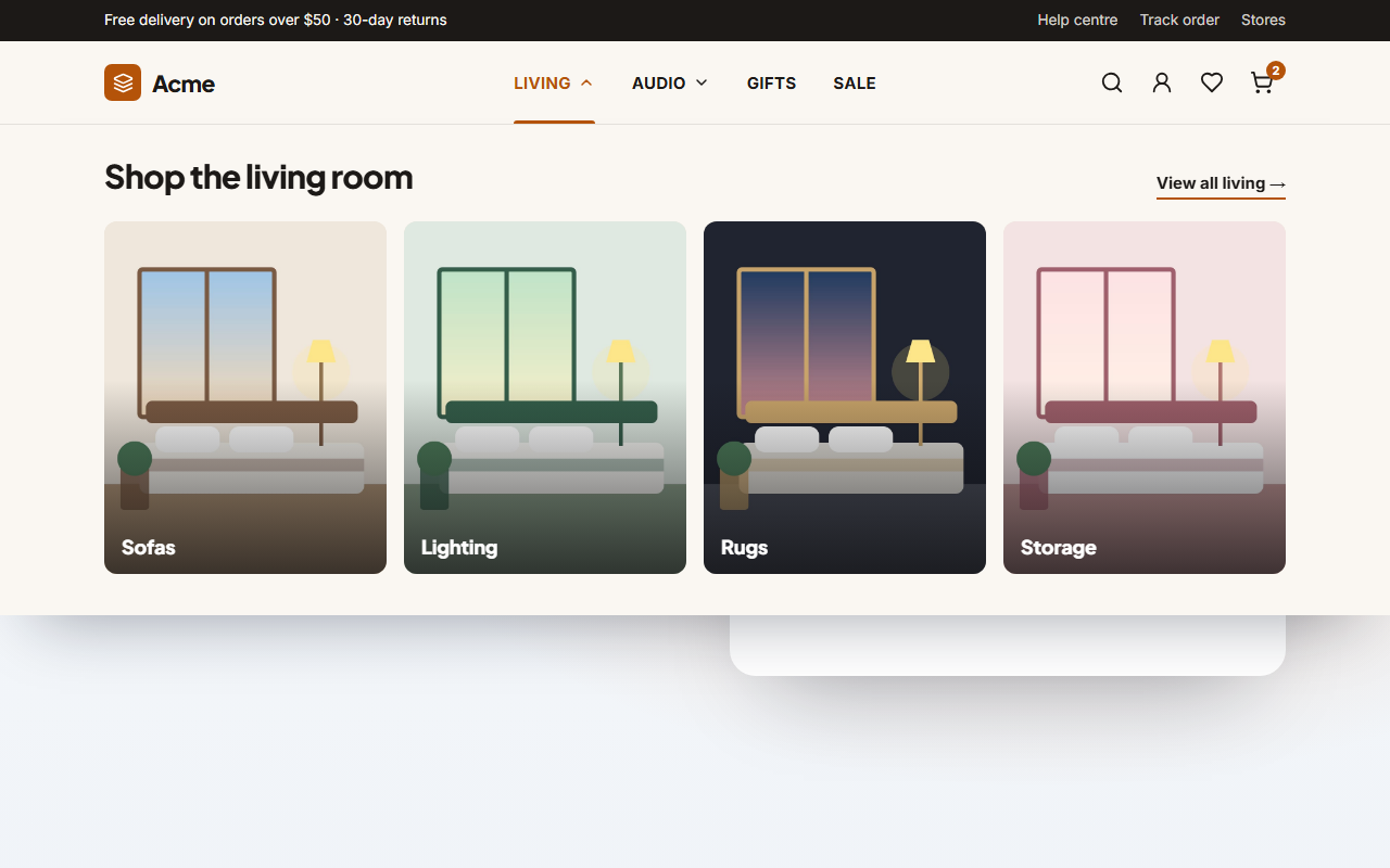
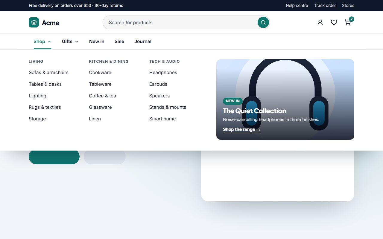
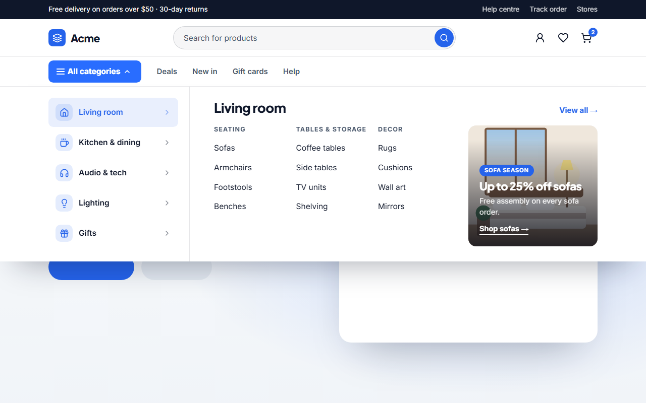
Ecommerce Mega Menu — Image Tiles is a free, editorial store header for shops that sell with pictures. The logo sits on the left, the categories in the centre and the search, account, wishlist and cart icons on the right. Open a category and a panel drops down with a heading, a view-all link and up to four large photo tiles, each with its own label and link.
Let the photos do the navigating
Fashion, home and lifestyle shoppers choose by looking, not by reading link lists. Each tile is a tall 4:5 photo with a soft gradient and a bold label, and it zooms gently when you point at it. Leave a tile's label empty and it disappears; leave the first tile empty and the item becomes a plain link such as Gifts or Sale.
Quiet, editorial header
The header uses upper-case category names with a brand-colour underline that slides in on hover, a warm paper-like background and a thin top bar for delivery news. All of it comes from the shared theme, so switching to a dark or colourful preset restyles the header, the panels and the tiles at once.
Accessible and responsive
Categories are buttons with aria-expanded and aria-controls. Arrow Down opens a panel and moves focus to its first tile, Esc closes it and returns focus, and only one panel is open at a time. On phones the header collapses into a burger menu, and each category opens as an accordion with a two-column tile grid.
Edit and export
Upload photos for every tile (resized in your browser) or paste image links, rewrite the headings and links, and export one HTML file, a ZIP with your images, a React or Vue component, or fork it into My Code. For the shop below it, try the Product Grid, and for a search-first header see the Link Columns Mega Menu.
Why use it
Why Use the Ecommerce Mega Menu — Image Tiles
How it’s different
How It’s Different From Other Free Section Templates
Step by step
How to Use
- 1Edit the contentFill in the logo, top bar, search & icons and menu items in the panel. Switch the top bar on or off. Wrap words in *asterisks* to colour them.
- 2Add your imagesUpload your own images (resized in your browser and kept on your device) or paste a hosted image URL.
- 3Match your brandPick a colour preset or exact colours, choose heading and body fonts from Google Fonts or your own uploaded font, set the corner radius and width, or apply your brand kit.
- 4Animate and previewChoose a GSAP entrance effect and speed, press Play animation, and check the section on desktop, tablet and mobile.
- 5Save and exportSave it to My designs, then export a single HTML file, a ZIP with your images, a React or Vue component, or fork it into My Code.
Real-world uses
Common Use Cases
Got questions?
Frequently Asked Questions
Up to four tiles per menu item. Leave a tile label empty to hide that tile. If the first tile has no label, the menu item becomes a plain link with no dropdown.
Tiles use a 4:5 portrait frame, so photos around 640 by 800 pixels work well. Uploads are resized in your browser, and the crop keeps the middle of the picture.
This header keeps the centre for the categories and uses a search icon that links to your search page. For a full search field under the logo, use the Link Columns or Department Sidebar mega menu.
Yes. Pick a dark preset or set your own colours in the theme panel. The header, panels, icons and badges all read the same colours, so they restyle together.
It saves an editable copy of your Ecommerce Mega Menu — Image Tiles in My Code, the UI Snippets code editor: the section markup goes in the HTML panel, its CSS (theme variables, base styles and layout) in the CSS panel, and the GSAP library is added as a CDN link, so you can keep refining the code and save your own versions.
Yes. Every section is free for personal and commercial work, with no account, no watermark and no attribution: export it on its own as HTML, React, Vue or Next.js from its page, or use it in a website you build and export in the Website Builder.