
Desktop · 1280px · shown at 0% · edit the text, images and colours in the panel
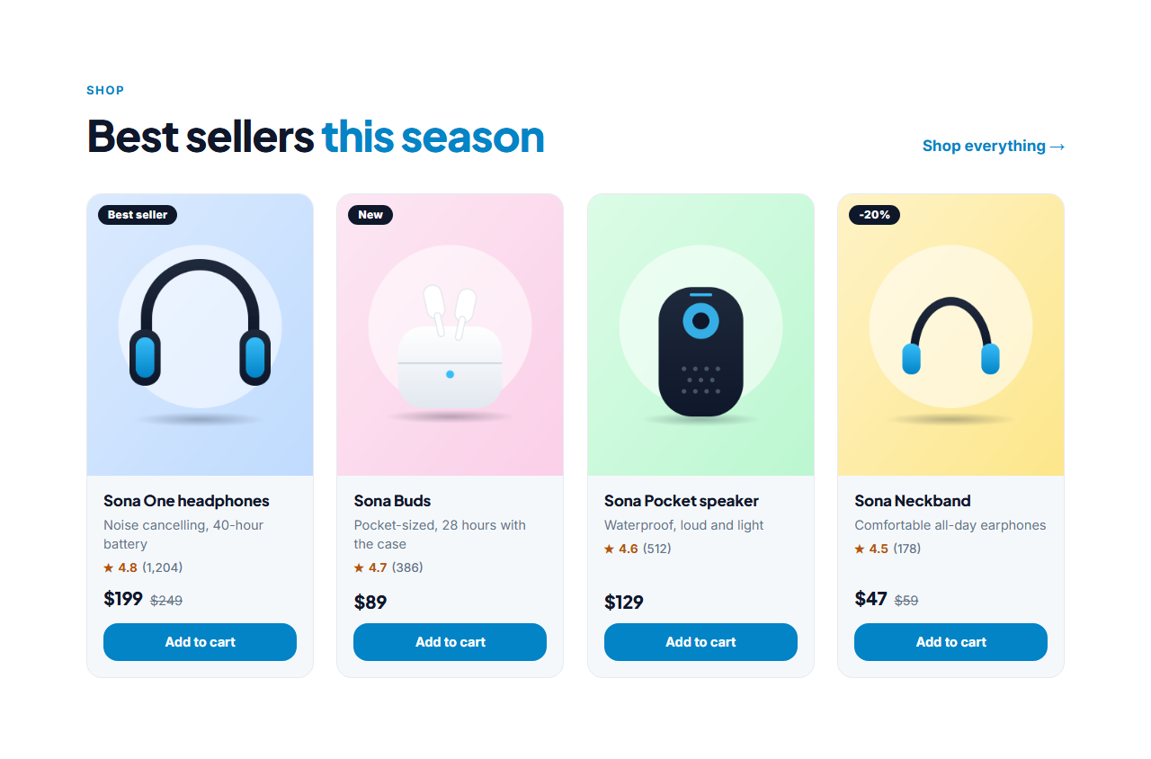
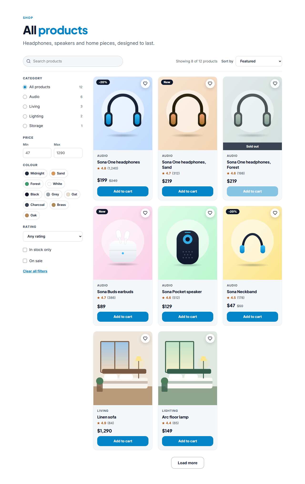
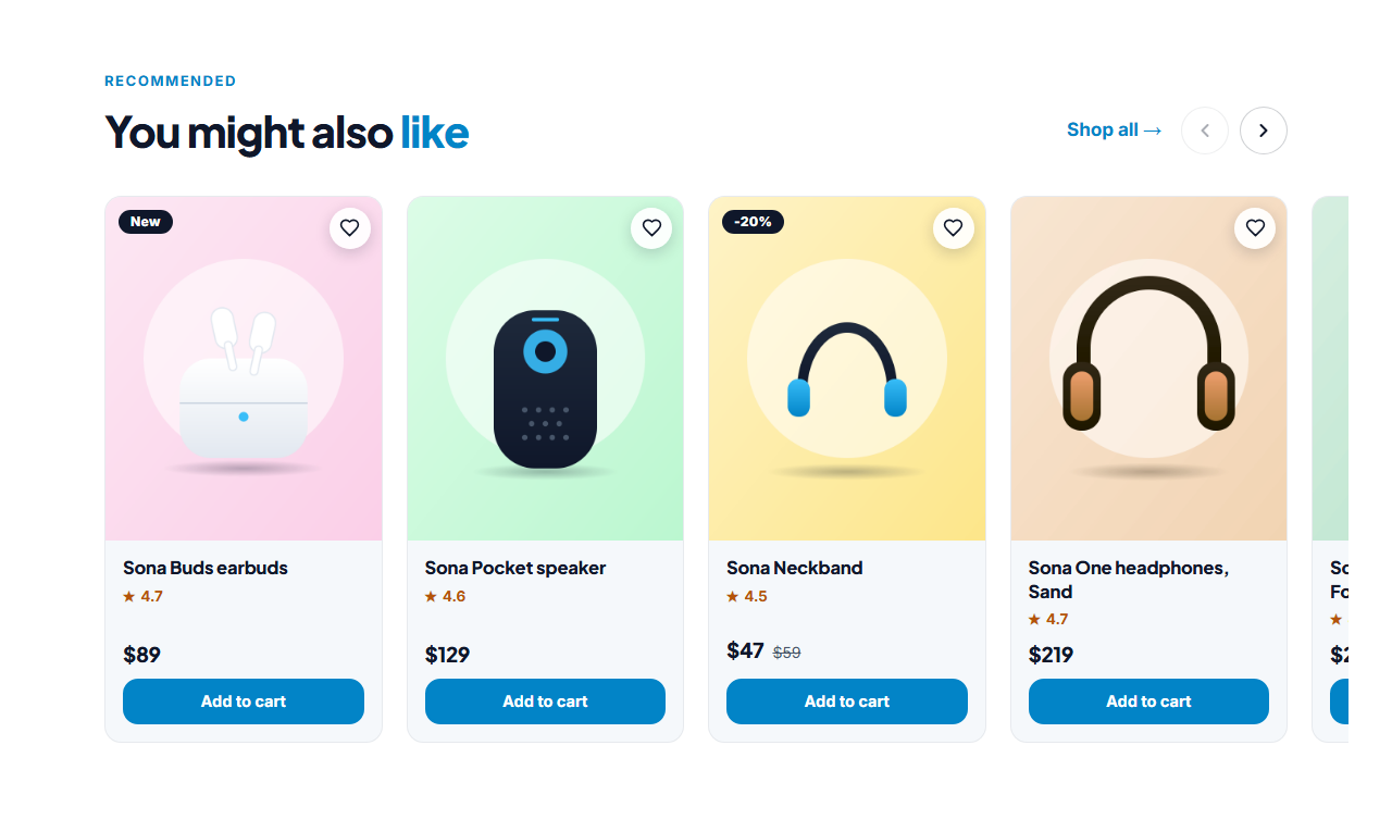

Product Detail Page — Free Website Section Template
Menus & listings · v1.0.0 · Updated 2026-11-14 · Responsive · GSAP animation · HTML, React & Vue
Extend with AI
Take This Section Further With AI
Ask an AI assistant to adapt the product page: add a lightbox for the photos, a size-guide modal, a delivery estimate that depends on the postcode, or a cart drawer that opens when Add to cart is pressed.
Prompt to recreate it
Copy this into your AI assistant of choice to build the effect from scratch, or as a jumping-off point for your own variant:
Create a responsive product detail page section in plain HTML, CSS and JavaScript.

- Two columns: a gallery on the left (a vertical thumbnail strip, a 4:5 main photo with previous / next arrows, a counter, swipe on touch and Left / Right keys, and a hover zoom around the pointer) and the buy box on the right. The gallery is sticky while the buy box scrolls.
- Buy box: category, product name, star rating with a partly filled star and review link, price with a crossed-out old price and a "Save $50" label, a short description, colour swatches (radio buttons) and size buttons (radio buttons, sold-out sizes struck through and disabled), a quantity stepper 1-10, an Add to cart link, a ghost Buy now link and a wishlist heart with aria-pressed.
- Choosing a colour shows the photo tagged with that colour, and showing a photo selects its swatch.
- If sizes exist and none is chosen, Add to cart shows an error and scrolls the sizes into view. Otherwise it adds ?colour=...&size=...&qty=... to the link.
- Below: stock and delivery notes, trust badges with icons and details in accordions (the first open).
- On screens under 620 px stack the layout, put thumbnails under the photo and show a sticky Add to cart bar whenever the main button is off screen (IntersectionObserver).
- Add Product JSON-LD with name, image, description, offers (price, priceCurrency, availability) and aggregateRating.
Want to tighten it up first? Run this prompt through the AI Prompt Studio to score it across 8 quality dimensions, catch anti-patterns, and tune the wording for Claude, ChatGPT, or Gemini before you paste it in.
What's included
Features
About this section
Product Detail Page — Free Ecommerce Product Page Template
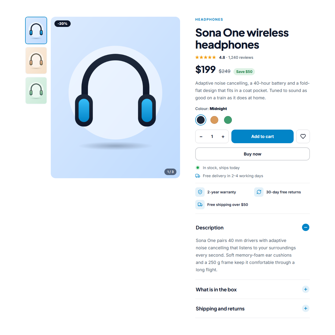
Product Detail Page is a free, responsive product page section for online stores, launch pages and one-product shops. A photo gallery sits on the left and the buy box on the right: the name, a star rating, the price with a crossed-out old price and a savings badge, colour swatches, size buttons, a quantity stepper, Add to cart, Buy now and a wishlist heart. Below the buttons come stock and delivery notes, trust badges and details in accordions.
A gallery that shows the product
Shoppers cannot touch a product, so the photos do the selling. The gallery has a thumbnail strip, previous and next arrows, a photo counter, swipe on touch screens and Left and Right keys, and on a computer the photo zooms around the pointer. Choose a colour and the gallery jumps to the photo you tagged with that colour; show that photo and the matching swatch is selected.
Options that behave properly
Colours and sizes are real radio buttons with labels for screen readers. A sold-out size is struck through and cannot be chosen. If your product has sizes and the visitor presses Add to cart without picking one, a clear message appears and the sizes scroll into view instead of sending an incomplete order.
Works with the checkout you already have
The section displays the product and links out, so it does not take payments itself. Point Add to cart and Buy now at your Shopify, Stripe, Gumroad or WooCommerce link, and the chosen colour, size and quantity are added to the link as ?colour=...&size=...&qty=.... With a plain "#" link it shows a confirmation so you can preview the flow.
Built for phones and for search
On a phone the photos come first with thumbnails beneath them, and a sticky Add to cart bar slides up whenever the main button is out of view, so buying is always one tap away. For search engines the section writes Product structured data with the name, description, photos, price, currency, availability and, when you enter them, an aggregate rating.
Edit and export
Upload photos in the browser or paste links, edit every label and list, and switch colours, sizes, wishlist, trust badges and the sticky bar on or off. Export one HTML file with the CSS included, a ZIP with your images, a React or Vue component, or fork it into My Code. Show the rest of your range with the Product Grid, and add navigation with an Ecommerce Mega Menu.
Why use it
Why Use the Product Detail Page
How it’s different
How It’s Different From Other Free Section Templates
Step by step
How to Use
- 1Edit the contentFill in the product, price & rating, gallery, colours, sizes, buttons & notes, trust badges, details and labels (screen readers) in the panel. Switch the colours, sizes and trust badges on or off. Wrap words in *asterisks* to colour them.
- 2Add your imagesUpload your own images (resized in your browser and kept on your device) or paste a hosted image URL.
- 3Match your brandPick a colour preset or exact colours, choose heading and body fonts from Google Fonts or your own uploaded font, set the corner radius and width, or apply your brand kit.
- 4Animate and previewChoose a GSAP entrance effect and speed, press Play animation, and check the section on desktop, tablet and mobile.
- 5Save and exportSave it to My designs, then export a single HTML file, a ZIP with your images, a React or Vue component, or fork it into My Code.
Real-world uses
Common Use Cases
Got questions?
Frequently Asked Questions
No. It displays the product and links out. Point Add to cart and Buy now at a checkout or payment link from a store platform such as Shopify, Stripe or Gumroad, which handles payment securely.
Give a gallery photo a colour name that matches a swatch. Choosing the swatch shows that photo, and showing that photo selects the swatch. Photos without a colour name simply do not change the selection.
Sold-out sizes are marked in the editor, drawn struck through and disabled, so they cannot be chosen. Screen readers hear the size followed by your sold-out wording.
Yes. It writes Product data with the name, description, photos, price, currency and availability, plus an aggregate rating when you enter a rating and a review count.
Put your cart or checkout address in the Add to cart link. The section adds the chosen colour, size and quantity as ?colour=...&size=...&qty=... so a cart script or a store that accepts those parameters can read them.
It saves an editable copy of your Product Detail Page in My Code, the UI Snippets code editor: the section markup goes in the HTML panel, its CSS (theme variables, base styles and layout) in the CSS panel, and the GSAP library is added as a CDN link, so you can keep refining the code and save your own versions.
Yes. Every section is free for personal and commercial work, with no account, no watermark and no attribution: export it on its own as HTML, React, Vue or Next.js from its page, or use it in a website you build and export in the Website Builder.