
Desktop · 1280px · shown at 0% · edit the text, images and colours in the panel


Project Cards — Free Website Section Template
Menus & listings · v1.0.0 · Updated 2026-11-15 · Responsive · GSAP animation · HTML, React & Vue
Extend with AI
Take This Section Further With AI
Rather than editing cards by hand, ask an AI assistant to load your repositories from the GitHub API, add filter chips by category, or open a longer case study in a modal when a card is clicked.
Prompt to recreate it
Copy this into your AI assistant of choice to build the effect from scratch, or as a jumping-off point for your own variant:
Create a developer portfolio projects grid in HTML and CSS.

- A heading and intro, then a responsive grid (auto-fit, 320px minimum) of project cards on a dark theme.
- Each card has a 16:10 screenshot cropped from the top with a small year badge in the corner, a title, a one-sentence description, a row of technology tags in a monospace font (small rounded chips in the accent colour) and two links at the bottom: "Live demo →" in bold with an accent underline and a quieter "Source" link.
- On hover the card lifts 4px, its border turns the accent colour and the screenshot zooms to 1.05; disable these for prefers-reduced-motion.
- Show a visible focus outline on the links.
Want to tighten it up first? Run this prompt through the AI Prompt Studio to score it across 8 quality dimensions, catch anti-patterns, and tune the wording for Claude, ChatGPT, or Gemini before you paste it in.
What's included
Features
About this section
Project Cards — Free Developer Portfolio Projects Grid
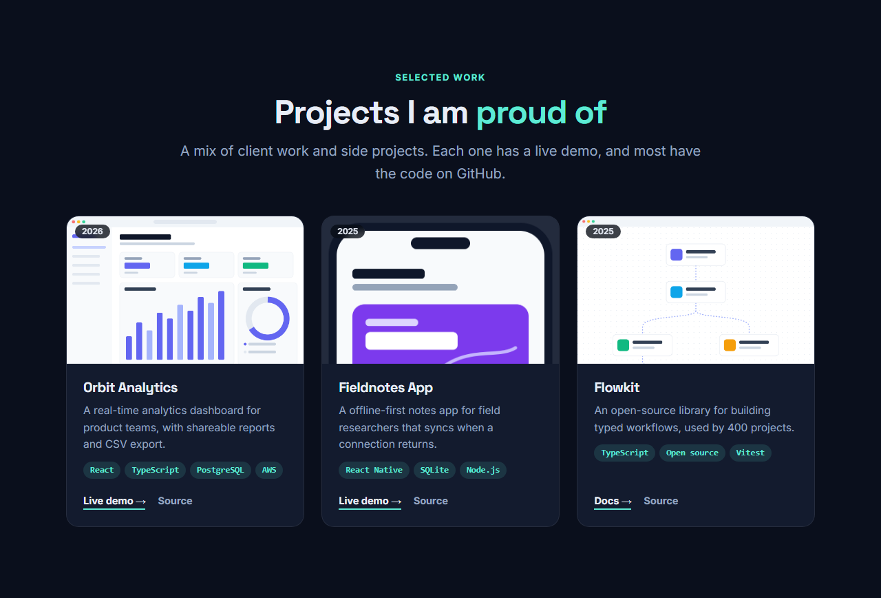
Project Cards is the projects grid every developer portfolio needs. Each card shows a screenshot with a year badge, the project name and a one-sentence description, a row of technology tags and two links: a live demo and the source code. The grid adapts from three columns to one, and the screenshot zooms gently on hover.
Tags are one per line
Type the technologies for each project one per line, such as React, TypeScript and PostgreSQL, and they become small monospace chips. There is nothing to configure and nothing to keep in sync, and the chips make a project scannable at a glance, which recruiters and clients appreciate.
Two clear links
Every card has a primary link, usually a live demo, docs or case study, and a quieter link to the source on GitHub. Either can be left empty, so closed-source client work can show a demo only, and a library can show docs and code.
Screenshots that fit
Screenshots are cropped to a 16 by 10 frame and aligned to the top, which suits web pages and dashboards. Use consistent screenshots, with the same browser frame or none, so the grid looks like a set. Add alt text that describes what the screenshot shows.
Hosting your portfolio
The grid needs no JavaScript, so the export works on GitHub Pages, Netlify or any static host, and it stays fast with a dozen screenshots because each one loads only when it scrolls near the screen. Open the page with a Terminal Hero and follow the grid with a Vertical Timeline of your experience.
Choosing which projects to show
Show your best six projects rather than everything you have built. Lead with the one you are proudest of, explain the result in the description, and make sure every demo link still works.
Why use it
Why Use the Project Cards
How it’s different
How It’s Different From Other Free Section Templates
Step by step
How to Use
- 1Edit the contentFill in the heading and projects in the panel. Wrap words in *asterisks* to colour them.
- 2Add your imagesUpload your own images (resized in your browser and kept on your device) or paste a hosted image URL.
- 3Match your brandPick a colour preset or exact colours, choose heading and body fonts from Google Fonts or your own uploaded font, set the corner radius and width, or apply your brand kit.
- 4Animate and previewChoose a GSAP entrance effect and speed, press Play animation, and check the section on desktop, tablet and mobile.
- 5Save and exportSave it to My designs, then export a single HTML file, a ZIP with your images, a React or Vue component, or fork it into My Code.
Real-world uses
Common Use Cases
In real websites
Website Templates That Use the Project Cards Section
The Project Cards section is part of 1 complete website template in the free Website Builder, so you can see it in a full page before you use it on its own: Developer Portfolio Website (Dark). Open any of them in the builder to edit the whole page, or keep customising this section by itself.
Got questions?
Frequently Asked Questions
Type them one per line in the Technology tags field of each project. Each line becomes a small chip on the card, so no other setup is needed.
Yes. Leave the code link text empty and only the demo link shows, which suits private client work. The same works the other way round for libraries without a demo.
About 1200 by 750 pixels (16 by 10). They are cropped to that frame from the top, so put the most important part of the page at the top of the screenshot.
Up to twelve fit, but four to six of your best projects work better. Fewer, stronger cards are easier to judge than a long list.
It saves an editable copy of your Project Cards in My Code, the UI Snippets code editor: the section markup goes in the HTML panel, its CSS (theme variables, base styles and layout) in the CSS panel, and the GSAP library is added as a CDN link, so you can keep refining the code and save your own versions.
Yes. Every section is free for personal and commercial work, with no account, no watermark and no attribution: export it on its own as HTML, React, Vue or Next.js from its page, or use it in a website you build and export in the Website Builder.