

Marker Highlight Sweep — Animated Text Highlighter in CSS
Marker Highlight Sweep · Text Animation · Plain HTML, CSS & JS · Live preview
Copy & paste
Source Code
<main class="page">
  <article class="note" id="note">
    <p class="meta">Field notes · Issue 12</p>
    <h1>Good design is mostly <mark class="hl yellow">deciding what to leave out</mark>.</h1>
    <p>Before you add another section, ask who it's for. The pages people finish reading usually have <mark class="hl pink">one clear promise</mark>, a headline that says it plainly, and <mark class="hl green">a single next step</mark>. Everything else is noise you are paying for in <mark class="hl blue">attention you don't get back</mark>.</p>
    <button type="button" class="again" id="again">Highlight again</button>
  </article>
</main>*{box-sizing:border-box;margin:0;padding:0}
body{background:#fbf8f1;font-family:Georgia,'Times New Roman',serif;color:#23201b;min-height:100vh;display:grid;place-items:center}
.page{padding:32px 20px;width:100%}
.note{max-width:640px;margin:0 auto}
.meta{font:600 12px system-ui,sans-serif;letter-spacing:.24em;text-transform:uppercase;color:#9b8f7a;margin-bottom:14px}
h1{font-size:clamp(30px,5.4vw,46px);line-height:1.22;font-weight:700;margin-bottom:22px}
p{font-size:clamp(17px,2.4vw,20px);line-height:1.75;color:#3b362d}
/* The marker is a background gradient that grows from 0 to 100% width. box-decoration-break keeps it working across line wraps. */
.hl{--c:#fde047;color:inherit;padding:.05em .18em;margin:0 -.12em;border-radius:.2em;
background:linear-gradient(104deg,transparent .9%,var(--c) 2.4%,var(--c) 97%,transparent 99%) no-repeat 0 78% / 0% 62%;
-webkit-box-decoration-break:clone;box-decoration-break:clone;
transition:background-size .9s cubic-bezier(.6,.1,.2,1)}
.yellow{--c:#fde047}.pink{--c:#fbb6d4}.green{--c:#a7f3b8}.blue{--c:#a5d8ff}
.note.go .hl{background-size:100% 62%}
.again{margin-top:26px;font:600 13px system-ui,sans-serif;color:#23201b;background:transparent;border:2px solid #23201b;border-radius:999px;padding:9px 22px;cursor:pointer}
.again:hover{background:#23201b;color:#fbf8f1}
.again:focus-visible{outline:2px solid #2563eb;outline-offset:3px}
@media (prefers-reduced-motion:reduce){.hl{background-size:100% 62%;transition:none}}var note = document.getElementById('note');
var marks = note.querySelectorAll('.hl');
// Give each highlight its own start time, in reading order, so the pen "moves on" through the text
marks.forEach(function (m, i) { m.style.transitionDelay = (0.4 + i * 0.9) + 's'; });
function sweep() {
note.classList.remove('go');
void note.offsetWidth; // restart from empty
note.classList.add('go');
}
// Start when the note is actually on screen
if ('IntersectionObserver' in window) {
var io = new IntersectionObserver(function (entries) {
if (entries[0].isIntersecting) { sweep(); io.disconnect(); }
}, { threshold: 0.4 });
io.observe(note);
} else {
sweep();
}
document.getElementById('again').addEventListener('click', sweep);Extend with AI
Take This Snippet Further With AI
Ask an AI coding assistant to explain why the highlight is a background gradient on an inline mark with box-decoration-break: clone and not a pseudo-element, and how the angled gradient with transparent ends creates the felt-pen look. A useful follow-up is how to make the highlight draw from right to left for RTL text.
Prompt to recreate it
Copy this into your AI assistant of choice to build the effect from scratch, or as a jumping-off point for your own variant:
Build an animated text-highlighter effect in plain HTML, CSS and JavaScript that works when a highlighted phrase wraps across two lines.

Requirements:
- Use real <mark> elements inside a paragraph and heading. Each gets its colour from a --c custom property, with at least four colour classes.
- Draw the marker as a background-image linear-gradient with a slight angle (about 104 degrees) and soft transparent ends, no-repeat, positioned low in the text line with a background height of about 60%, and set box-decoration-break to clone (also the -webkit- version) so each wrapped line gets its own stripe.
- Animate background-size from 0% to 100% width with a transition of about 0.9s on an ease-in-out curve.
- JavaScript gives each mark a transition delay based on its index so the stripes are drawn one after another in reading order.
- Start the sweep when the article is at least 40% visible using an IntersectionObserver (with a fallback that starts immediately), and add a button that restarts it by removing the class, forcing a reflow and re-adding it.
- Under prefers-reduced-motion, show the finished highlights with no transition.
Want to tighten it up first? Run this prompt through the AI Prompt Studio to score it across 8 quality dimensions, catch anti-patterns, and tune the wording for Claude, ChatGPT, or Gemini before you paste it in.
What's included
Features
box-decoration-break: clone makes every line fragment of a long phrase draw its own complete stripe.--c sets each marker colour, so adding a fifth is one extra class.<mark> element, and reduced-motion visitors see the finished highlights instantly.About this UI Snippet
Marker Highlight Sweep — Animated Background Gradient Highlight That Survives Line Wraps
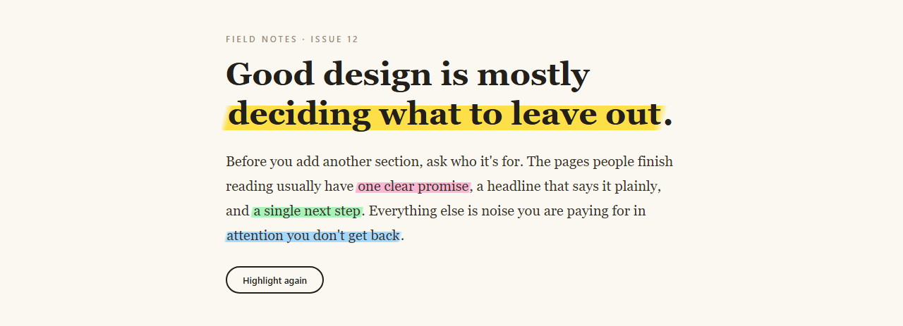
Highlighting the important phrase in a paragraph is an editor's habit, and animating it makes a reader's eye land on it. The trick with highlights on the web is that most approaches break when the phrase spans two lines. This one is built to wrap: each marked phrase is an inline <mark> whose background is a gradient that grows from 0 to 100% width, with box-decoration-break: clone so every line fragment gets its own full stripe.
A gradient that looks hand-drawn
The marker is linear-gradient(104deg, transparent .9%, colour 2.4%, colour 97%, transparent 99%). The slight 104° angle and the soft transparent ends round the stripe's tips like a real felt tip, and background-position: 0 78% with background-size: 100% 62% sits it low across the lower two-thirds of the text rather than blanketing it. Negative horizontal margin and small padding let the stripe extend a bit past the words, like overshoot.
Animating background-size, with a staggered pen
Each highlight transitions background-size from 0% 62% to 100% 62% over 0.9s on an ease-in-out curve. JavaScript gives every mark a delay of 0.4 + 0.9 × index seconds, in reading order, so the effect feels like one pen moving through the text. An IntersectionObserver starts it only when the note is 40% visible, so readers don't miss it above the fold.
Accessible and re-runnable
<mark> is the correct semantic element for highlighted text, and screen readers can announce it. The text is fully readable before and after the sweep, and reduced-motion visitors get the finished highlights immediately. The button restarts the sweep by clearing the class and forcing a reflow.
Step by step
How to Use
- 1Paste the blocksA paper-coloured article renders with four phrases highlighted in yellow, pink, green and blue, sweeping in one after another once the note scrolls into view.
- 2Mark your own phrasesWrap any text in
<mark class="hl yellow">…</mark>. Pick yellow, pink, green or blue, or define a new colour with the--ccustom property. - 3Set the pen speedThe 0.9s in the CSS is each stripe's duration; the
0.9in the JS is the gap between stripes. Make them equal for a continuous stroke, or smaller for overlapping marks. - 4Change the stripe shapeAdjust the
62%height and the78%vertical position for a thinner underline-style marker or a full-height block. - 5Highlight on a different triggerCall
sweep()from a button, tab change, or hover on a parent card instead of the observer.
Real-world uses
Common Use Cases
Got questions?
Frequently Asked Questions
A pseudo-element is a single box, so it can't follow a phrase onto a second line. A background on an inline element with box-decoration-break: clone is the reliable way to get a stripe per line.
Make sure box-decoration-break: clone and the -webkit- version are both set, and that the mark is display: inline (not inline-block).
Yes, but swap the text colour and pick stripe colours with enough contrast against it. Mid-tone or neon-ish colours with dark text read better than pastels on dark backgrounds.
More than three or four in one screen dilutes the effect. A highlight works because it is rare; if everything is marked, nothing stands out.