
Perspective Crawl Credits — Receding 3D Scrolling Text
Perspective Crawl Credits · Text Animation · Plain HTML, CSS & JS · Live preview
Copy & paste
Source Code
<main class="space">
  <div class="stars" aria-hidden="true"></div>
  <div class="fade" aria-hidden="true"></div>
  <div class="viewport">
    <section class="crawl" id="crawl" aria-label="Project credits">
      <p class="chapter">Chapter 7</p>
      <h1>THE LONG BUILD</h1>
      <p>It started as a weekend experiment: a handful of snippets, a stubborn idea, and no plan for what came next. Months later the library had grown into something people actually used.</p>
      <p>Along the way, a small group of designers, developers and testers turned rough drafts into components that behave on every screen, in every browser, and for every kind of reader.</p>
      <p>To everyone who filed a bug, suggested a fix, or simply left a kind word: this one is for you. The next release is already underway.</p>
      <p class="credit"><strong>Written by</strong> The Maintainers</p>
      <p class="credit"><strong>Tested on</strong> Far too many phones</p>
      <p class="credit"><strong>Special thanks</strong> Everyone who read the docs</p>
    </section>
  </div>
  <div class="controls">
    <button type="button" id="toggle" aria-pressed="false">Pause</button>
    <label>Speed
      <select id="speed" aria-label="Crawl speed">
        <option value="70">Slow</option>
        <option value="48" selected>Normal</option>
        <option value="30">Fast</option>
      </select>
    </label>
  </div>
</main>*{box-sizing:border-box;margin:0;padding:0}
body{background:#02030a;font-family:'Franklin Gothic Medium','Arial Narrow',Arial,sans-serif;overflow:hidden}
.space{position:relative;height:100vh;min-height:520px;overflow:hidden;background:radial-gradient(ellipse at 50% 120%,#1a2140,#02030a 65%)}
.stars{position:absolute;inset:0;background-image:
radial-gradient(1px 1px at 12% 20%,#fff,transparent),radial-gradient(1.5px 1.5px at 31% 64%,#cfe0ff,transparent),
radial-gradient(1px 1px at 47% 12%,#fff,transparent),radial-gradient(1px 1px at 63% 78%,#fff,transparent),
radial-gradient(1.5px 1.5px at 78% 30%,#ffe9c2,transparent),radial-gradient(1px 1px at 90% 58%,#fff,transparent),
radial-gradient(1px 1px at 22% 88%,#fff,transparent),radial-gradient(1px 1px at 70% 8%,#fff,transparent),
radial-gradient(1px 1px at 5% 50%,#fff,transparent),radial-gradient(1.5px 1.5px at 55% 40%,#cfe0ff,transparent)}
.fade{position:absolute;inset:0 0 auto 0;height:42%;z-index:2;pointer-events:none;background:linear-gradient(#02030a 12%,transparent)}
.viewport{position:absolute;inset:0;perspective:340px;perspective-origin:50% 100%;display:flex;justify-content:center}
.crawl{position:absolute;bottom:0;width:min(560px,86vw);color:#ffd84a;font-size:clamp(17px,2.9vw,26px);line-height:1.6;font-weight:700;text-align:justify;
transform-origin:50% 100%;transform:rotateX(26deg) translateY(100%);animation:crawl 48s linear infinite}
@keyframes crawl{from{transform:rotateX(26deg) translateY(100%)}to{transform:rotateX(26deg) translateY(-190%)}}
.crawl p{margin-bottom:1.3em}
.crawl h1{text-align:center;font-size:1.9em;letter-spacing:.06em;margin:.2em 0 1em}
.chapter{text-align:center;letter-spacing:.3em;text-transform:uppercase;font-size:.8em}
.credit{text-align:center;text-transform:uppercase;letter-spacing:.14em;font-size:.82em;margin-bottom:.6em!important}
.credit strong{display:block;color:#fff3b0;font-size:.8em;letter-spacing:.3em}
.controls{position:absolute;z-index:3;bottom:16px;left:50%;transform:translateX(-50%);display:flex;gap:14px;align-items:center;color:#93a0c6;font:13px system-ui,sans-serif}
.controls button,.controls select{font:600 13px system-ui,sans-serif;color:#e8edff;background:#141a33;border:1px solid #2a3560;border-radius:8px;padding:7px 14px;cursor:pointer}
.controls label{display:flex;gap:8px;align-items:center}
.controls :focus-visible{outline:2px solid #ffd84a;outline-offset:2px}
@media (prefers-reduced-motion:reduce){.crawl{animation:none;transform:rotateX(14deg) translateY(-30%);position:relative;margin-top:12vh}}var crawl = document.getElementById('crawl');
var toggle = document.getElementById('toggle');
var speed = document.getElementById('speed');
toggle.addEventListener('click', function () {
var paused = crawl.style.animationPlayState === 'paused';
crawl.style.animationPlayState = paused ? 'running' : 'paused';
toggle.textContent = paused ? 'Pause' : 'Play';
toggle.setAttribute('aria-pressed', String(!paused));
});
// Changing animation-duration mid-run jumps the position, so restart the crawl from the bottom
speed.addEventListener('change', function () {
crawl.style.animation = 'none';
void crawl.offsetWidth;
crawl.style.animation = 'crawl ' + speed.value + 's linear infinite';
if (toggle.getAttribute('aria-pressed') === 'true') crawl.style.animationPlayState = 'paused';
});Extend with AI
Take This Snippet Further With AI
Ask an AI coding assistant why perspective-origin is set to 50% 100% rather than the default centre, and why rotateX is written before translateY in the transform. It's also worth asking how to drive the crawl from scroll position instead of a timed animation.
Prompt to recreate it
Copy this into your AI assistant of choice to build the effect from scratch, or as a jumping-off point for your own variant:
Build a perspective text crawl (opening-credits style) in plain HTML, CSS and a little JavaScript.

Requirements:
- A full-height dark scene with a CSS-only starfield made from layered radial-gradients, and a viewport element with perspective around 340px and perspective-origin 50% 100%.
- A block of bold yellow justified text (a chapter label, a centred title, three paragraphs and a few centred credit lines) positioned at the bottom, with transform-origin 50% 100%, rotated about 26 degrees on the X axis.
- A CSS keyframe animation that keeps the same rotateX and moves translateY from 100% to about -190% linearly and infinitely, so the text recedes and shrinks toward the vanishing point. Write rotateX before translateY in the transform.
- A gradient overlay across the top that fades the text into the background.
- Controls: a Pause/Play button using animationPlayState with aria-pressed, and a speed select (slow, normal, fast) that restarts the animation with a new duration, since editing the duration mid-run causes a jump.
- Under prefers-reduced-motion, replace the animation with a static, readable tilted block.
Want to tighten it up first? Run this prompt through the AI Prompt Studio to score it across 8 quality dimensions, catch anti-patterns, and tune the wording for Claude, ChatGPT, or Gemini before you paste it in.
What's included
Features
rotateX shrinks text toward a vanishing point with no JavaScript maths.radial-gradient dots, so there are no image requests.About this UI Snippet
Perspective Crawl Credits — rotateX Tilt, Perspective Origin and a Fade Mask
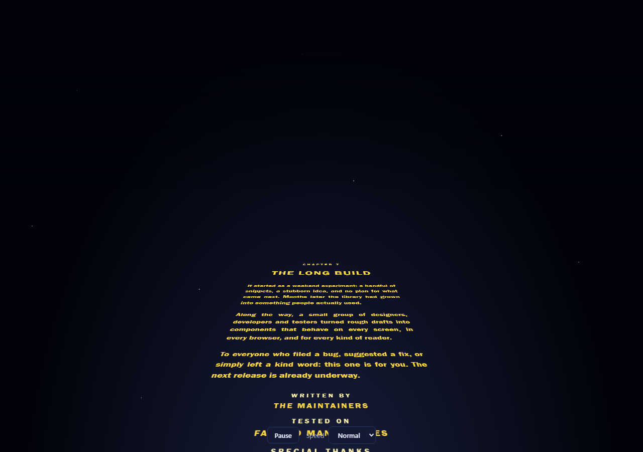
Text that slants back and shrinks as it travels toward a vanishing point is one of cinema's most recognisable title treatments, and it's a pure CSS 3D transform. This snippet turns it into a credits roll: a block of yellow text is tilted away from the viewer and scrolls up, shrinking as it recedes, over a field of CSS-drawn stars.
Two properties create the depth
The wrapper has perspective: 340px and perspective-origin: 50% 100%. That low origin matters: it puts the vanishing point at the bottom centre, so the crawl converges on the middle of the screen rather than a point behind the text. The text itself is rotateX(26deg) and is animated only by translateY, from 100% below its box to 190% above, so everything the browser needs is a transform on one layer.
Why the order of transforms matters
rotateX comes first and the translateY after it, so the movement follows the tilted plane instead of the screen. Reverse them and the text slides straight up and tilts in place. transform-origin: 50% 100% anchors the tilt at the bottom edge so the text rotates away from the viewer's feet.
Fade, controls and reduced motion
A gradient overlay at the top fades the text to the page colour as it shrinks, so lines don't pop out at the horizon. The pause and speed controls are real buttons; changing speed restarts the animation because editing animation-duration mid-run causes a jump. Reduced-motion visitors get a static, readable tilted block instead of the scroll. The stars are a stack of radial-gradient layers, not images.
Step by step
How to Use
- 1Paste the three blocksA dark starfield appears and a yellow block titled "THE LONG BUILD" begins crawling up and away. Pause and speed controls sit at the bottom.
- 2Replace the contentEdit the heading and paragraphs inside
#crawl. Use the.creditclass for centred role-and-name lines at the end. - 3Change the tiltThe 26deg in both the base style and the keyframes is the tilt. Smaller angles look flatter; bigger ones make the text shrink faster. Keep the two values identical.
- 4Set the lengthThe final
translateY(-190%)decides how far the text travels. Longer content needs a larger negative value and a longer duration so the pace stays steady. - 5Match your brandChange the text colour, the sky gradient, and the star positions in the
radial-gradientstack. White text on a deep blue works as well as yellow.
Real-world uses
Common Use Cases
Got questions?
Frequently Asked Questions
3D-transformed text is rasterised, so very small text can shimmer. Use a heavier weight and a font size of at least 18px at the bottom, where the text is largest.
Change infinite to 1 and add animation-fill-mode: forwards so the last frame stays, or hide the container with a final keyframe.
Yes. The width uses min(560px, 86vw) and the font scales with clamp(). Reduce the tilt slightly on very narrow screens if the text gets too thin at the top.
You can drive translateY from scroll position with animation-timeline: scroll() in current browsers or a scroll listener elsewhere, keeping the same perspective and rotateX.